About it
Qwant is an European search engine started in 2013. The essential value of Qwant is that we don’t “track” our users, and we promote neutrality and privacy. With nearly 60 million unique visitors per month, Qwant is in the top 1000 of the most viewed websites in the world.
After the released of the third version of Qwant on April 15, 2015, we handled the evolutions of the new design, to create a faster and a more efficient experience of the product
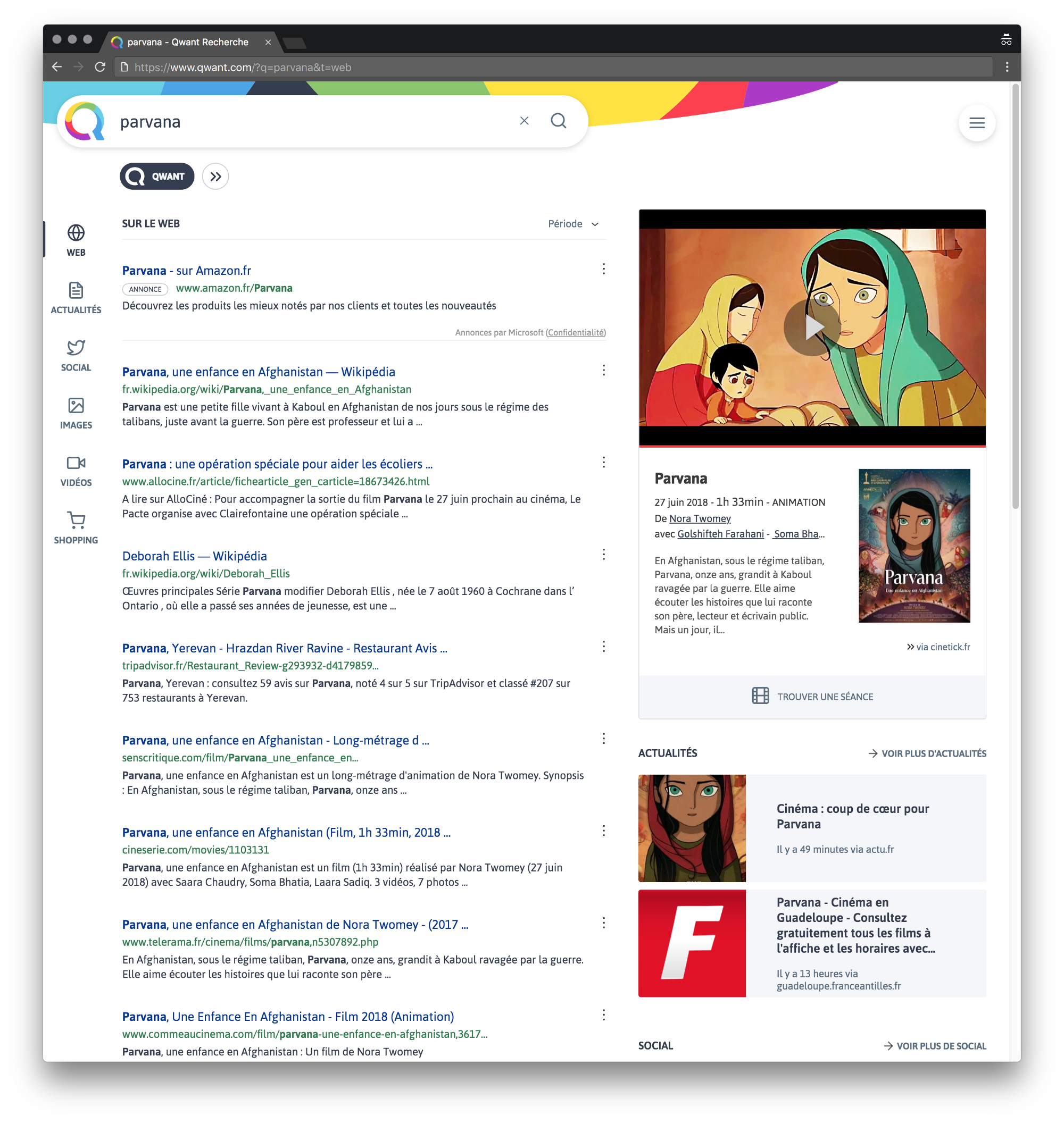
During the evolutions of the product over the years, some features appear that were not imagined at the beginning. It’s the case of the “verticals”, dedicated to music and video games and the “Instant Answers”, which goals is to provide quickly the more accurate answers to the users queries.
These constant iterations made the user experience more difficult. So we begin to analyse in-depth the strengths and weaknesses of the product in order to get down to the work on the 4th version of the product.
The Process
The two main needs of a modernized version were
- How do we increase company's incomes?
- The average user is 40 years old +. How do we target a younger audience?
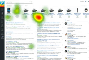
Starting with few assumptions and many feedbacks on social media, product reviews, etc. Our design team partnered with the LUTIN lab to conduct usability tests with a public sample representative of the population. The oculometric data (eye capture) and verbatim (free comments) assisted us to spot some points that needs to be enhanced in an ergonomic point of view. In order to target a considerably younger audience, we knew that we'll need to refresh the all branding and to infuse it in the UI.
The V4 is an in-depth revision of all the aspects of the flagship product.
We decided to drive our design work with three questions:
- How to allow an optimal reading of search results while still highlighting “hot” content (news, tweets)?
- How to facilitate exploratory searches on Qwant, through “verticals” (music, games)?
- How to modernize Qwant’s graphical universe while respecting its DNA?
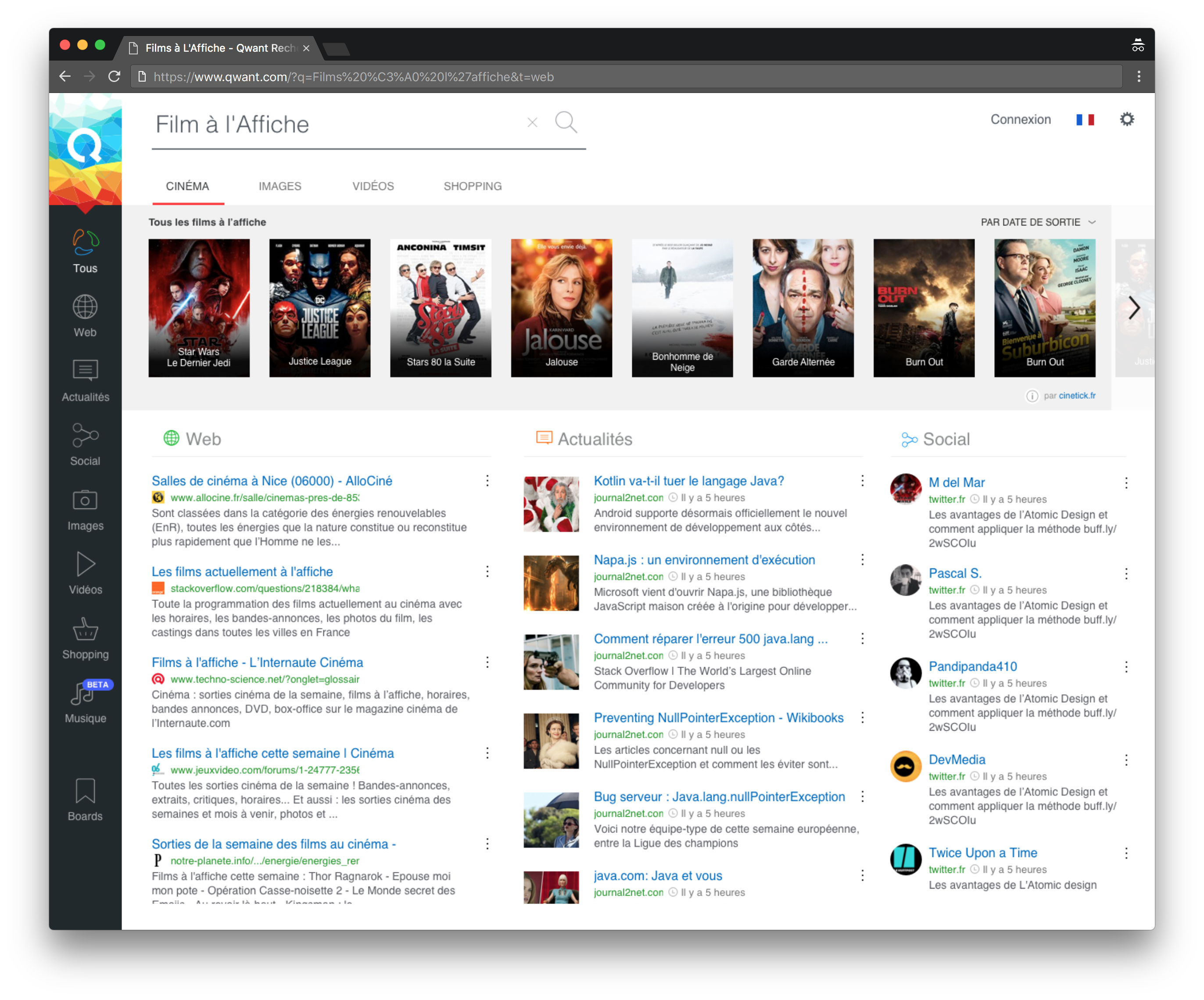
To improve the legibility of the page, we decided to change the legacy three column layout (web results, News and Social) to a two column layout.
The “Instant Answers”, initially placed at the top of the page, are now positioned to the top of the right column, reducing the interferences and improving the legibility. Our goal was to maintain the “F” reading pattern characteristic of search engine.
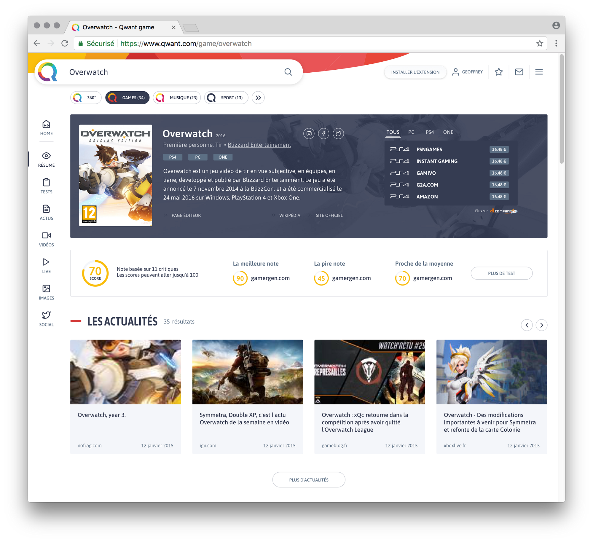
With the new design, our will was to create a better navigation between the core 360° search and the “Verticals”. The goals were to create dedicated search universe with distinct themes (Games, Music and soon Sports). When you enter a universe, the whole layout evolves to offer you an in-depth view of what you’re looking for. In the Music case, you can now search into the tracks, album of an artist and even find some gigs.
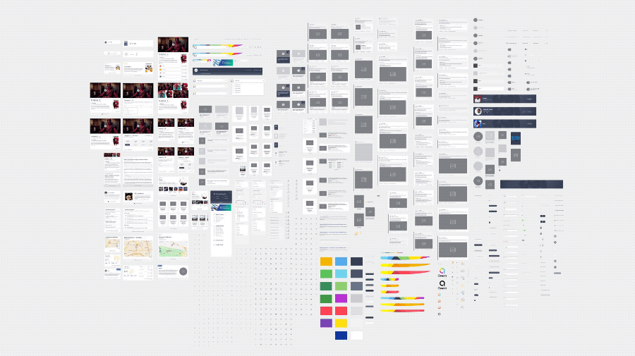
The first thing that we did, was to setup a brand new Design System. With all this design principles we gathered hundreds of components that help building a remarkably strong workflow between the design team and the developers.
After the project
TThe project was very well-received by all our users. We run an SUS survey that tops at 85% of satisfaction and the feedback on social media were astonishing. We're currently working on all the fixes. We're also preparing the later version of Qwant Junior.
The awesome peoples involved: Pierrick Thébault, Geoffrey Kazmierczak, Ophélie Le Bras and Hugo Leloup